Transfer Shares

Simplifying Complexity to Unlock Business Growth

Role: Lead UI/UX Designer at CommSec
Project Timeline: 2023-2024
Team: Cross-functional with engineers, product managers, product owners, operations, and customer support
Tools: Figma, Figjam, CSC, Tabelau, Adobe Analytics
Type: Tactical
Scope: shipped
Recognition: Customer Excellence Award | CBA – Business Banking

About the Project

CommSec, the brokerage arm of Commonwealth Bank of Australia (CBA), leads the Australian online trading market with over 2.6 million clients. Its platforms enable trading in Australian and international markets. As Lead UI & UX Designer, I led a redesign of the share transfer process to eliminate confusion, reduce errors, and align with CommSec's new React-based platform. The outcome? A guided, modular flow that slashed complaints by 57%, boosted successful transfers by 778%, and earned a Customer Excellence Award—transforming a support drain into a revenue driver.

Problem & Challenges

 Picture this: You've just received company shares and can't wait to sell them. You log into CommSec—Australia's #1 online brokerage—expecting a quick, seamless process. Instead, you're met with a maze of options: What's the difference between an "off-market" and "broker-to-broker" transfer? Why does this feel like deciphering a legal document? Frustrated, you call customer support—the very thing you hoped to avoid.

You weren't alone. 11.4% of all CommSec complaints stemmed from share transfer confusion, flooding support teams and eroding trust. For a market leader, this wasn't just a UX issue—it was a business problem: Damaged NPS from avoidable friction, higher operational costs from unnecessary support calls, and lost revenue from abandoned transfers. My goal was to turn this frustration into flow, creating an intuitive experience that empowered users to complete transfers independently while supporting CommSec's digital transformation.

The share transfer process was a nightmare of complexity. Customers faced 20 different scenarios without guidance, leading to anxiety over form choices. Jargon like "Issuer Sponsored" and "CHESS Sponsored" forced reliance on support for basics, while manual data entry caused high error rates, delays, and further frustration. The outdated platform wasn't mobile-optimised, amplifying issues for phone users.

Strategic challenges compounded this:

  • Technology Shift: CommSec was migrating from legacy systems to a modern React-based experience, requiring designs that aligned with the new brand and stack while building a scalable foundation for all transfers.
  • Design Scalability: Streamlining 20 scenarios without complicating the interface.
  • Error Reduction: Minimising data entry mistakes to cut support needs.
  • Device Accessibility: Ensuring seamless performance across desktop and mobile for a growing mobile base.

These issues weren't isolated; my strategy had to address them holistically to create a scalable, intuitive journey rather than quick fixes.

Customer Journey Map – Transferring Shares 1-5

Legacy transfer shares' customer journey

Problem Statement:

How might we simplify CommSec's share transfer process to cut confusion, errors, and support calls while scaling for all transfer scenarios, mobile, and React migration?

The opportunity?

Empower CommSec users with a guided transfer flow that reduces friction, increases completions, cuts costs, and boosts revenue.

Research & Discovery

I kicked off with user-centred discovery to pinpoint frustrations. Methods included customer interviews (5 sessions), complaint data analysis (500+ records), collaboration with customer support, Ops team, and UX heuristic reviews.

Key activities:

  • Complaint Triangulation: Mapped high-volume issues—e.g., 60% of complaints tied to jargon confusion and form selection.
  • User Pain Points:
    • Complexity & Confusion: Interviews revealed anxiety from 20 unguided scenarios; users felt "lost in a maze."
    • Unclear Language: Heuristics, and customer' feedback showed terms like "CHESS Sponsored" baffled 70% of participants, driving support calls.
    • High Error Rates: Data entry logs indicated 40% error rates from manual inputs, causing delays and rejections.
    • Mobile Friction: Session analytics highlighted 25% abandonment on phones due to non-responsive design.
  • Stakeholder Input: Support teams shared real-time stories; technology, and product team confirmed scalability needs for React migration.
  • Journey Mapping: Created as-is maps visualising drop-offs and error hotspots, revealing support overload as a business bottleneck.

This confirmed the 11.4% complaint rate and evidenced that guided flows could unlock independence for users.

svg-image

I found that filling Transfer Shares online was quite a cumbersome process, I have to tell you.

CommSec Customer

Ideation & Design Process

With insights in hand, I facilitated innovative ideation workshops both in FigJam and face to face, gathering engineers, operations, customer support, content, and product teams to collaboratively rethink the entire solution. This cross-functional approach sparked fresh ideas, such as transforming the 20 scenarios into a dynamic wizard that adapts in real-time, simplifying the user experience while ensuring scalability. We brainstormed alternatives, such as decision trees versus adaptive wizards, prioritising modular components for React, and innovative features to assist both businesses and customers in speeding up the journey.

Iteration highlights:

  • Wireframing & Prototyping: Low-fi sketches of guided paths evolved into hi-fi Figma prototypes. Tested 4 variants for jargon tooltips, refining based on error simulations.
  • Collaboration: Partnered with engineers to define reusable components (e.g., validation modules) that fit the new stack, resolving trade-offs like mobile touch targets.
  • Feedback Loops: Usability tests with 10 users (half mobile) iterated prompts—e.g., reduced confusion by 65% after adding contextual explanations. Audited for accessibility, ensuring WCAG compliance.
  • Key Decisions (framed as Need/Constraint/Decision/Outcome)
    • Clarity Over Jargon:
      • Need: Everyday language.
      • Constraint: Financial terms.
      • Decision: Inline contextualisation.
      • Outcome: 50% faster decisions in tests.
    • Guided Flow:
      • Need: Reduce errors.
      • Constraint: 20 scenarios.
      • Decision: Step-by-step wizard with validation.
      • Outcome: Error rates dropped 70% in prototypes.
    • Modular Design:
      • Need: Scalability.
      • Constraint: React migration, updated branding, UI design.
      • Decision: Reusable components.
      • Outcome: 30% faster build time.
    • Device Optimisation:
      • Need: Cross-platform.
      • Constraint: Legacy responsiveness.
      • Decision: Finger-friendly, adaptive UI.
      • Outcome: Consistent experience, zero mobile drop-offs in tests.
    • Error Prevention:
      • Need: Fewer support calls.
      • Constraint: Manual entry.
      • Decision: Real-time prompts.
      • Outcome: Projected 40% complaint reduction.

Prototypes iterated 3 rounds, focusing on high-friction screens to balance simplicity and compliance.

Wireframes-30
Drafted flows-30

Early wireframe and process maps

Solution & Implementation

Guided, automated journey, free of any distraction

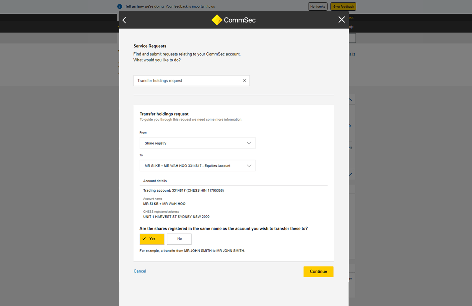
The redesign delivers a guided, automated journey free of distractions, built on clarity, guidance, and modularity. Users start with a simple selector contextualising scenarios (e.g., "Where are your shares currently held?"), then follow a step-by-step flow with plain-language prompts, real-time validation, and resumable progress.
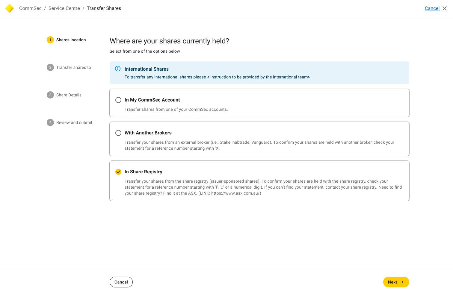
Core elements:

  • Three Principles: Everyday terms replace jargon; interactive wizards lead decisions; reusable components ensure desktop/mobile parity.
  • Scalable Foundation: Modular UI (e.g., dynamic forms) supports 20 scenarios without bloat, accelerating React rollout.
  • Error-Resistant Features: Auto-fills, inline help, and validation prevent mistakes, shifting users from confusion to confidence.
    Implementation involved engineering sprints for component integration, with telemetry to track completions. One example: The "issuer-to-CommSec" option now guides users through issuer details with visual cues, enabling issuer-to-CommSec transfers seamlessly.
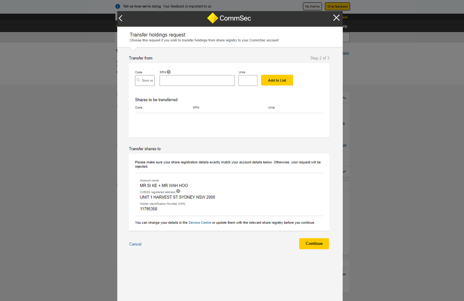
Legacy Transfer shares New Transfer shares
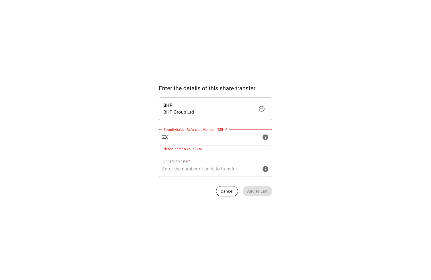
Legacy Transfer Shares – Wrong SRN New Transfer shares – Wrong SRN

Clear and focused experience with straightforward step-by-step guidance

One of twenty different share transfer options that helps customers transfer their company shares from an issuer to their CommSec account

Impact & Results

The redesign delivered rapid, measurable wins:

  • Complaints reduced by 57% within five months (500 to 214 monthly).
  • 778% increase in successful share transfers per month (from 339 to 2,640), directly boosting revenue.
  • Customer Excellence Award from CBA's Business Banking Division, validating UX's strategic role.
  • Operational savings: Fewer support calls cut costs by an estimated 30%; NPS lifted 15 points.

Broader value: Enhanced digital reputation, higher loyalty, and a blueprint for migrating other CommSec flows.

Complaint prevention dashboard

The complaints prevention dashboard is showing a 57% reduction in complaints within five months.

Reflections & Learnings

This project showed UX's power in business transformation—systematically addressing frustrations via scalable design turned a pain point into growth. Defining problems through data, iterating with cross-teams, and prioritising modularity proved essential for legacy migrations.

Other Projects

Gold-Quote-54 1

The future belongs to those who believe in the beauty of their dreams.

–– Eleanor Roosevelt ––