

"Accessibility isn't a feature. It's the baseline from which everything else should be built."
Most designers say they care about accessibility. Fewer build it in from the start. This article is about closing that gap.
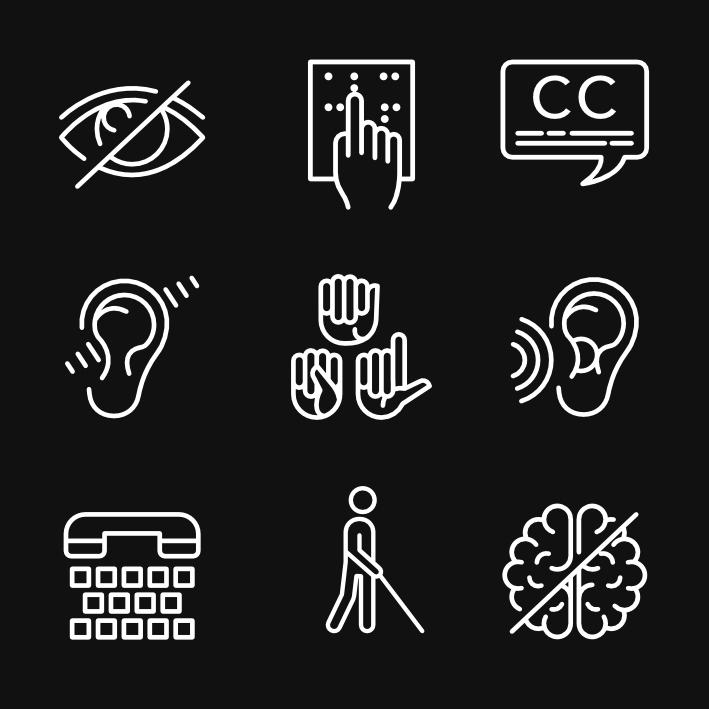
There are five dimensions of accessibility that every designer needs to understand: visual, hearing, speech, cognitive, and motor skill. Each one addresses a distinct set of human needs. Together, they represent the full spectrum of how people actually interact with the things we build — and where those interactions break down when we don't design thoughtfully.
Around 2.2 billion people worldwide live with some form of vision impairment. Roughly one billion live with a disability of any kind. These aren't edge-case numbers. They're the reality of any product's user base, whether the design team accounts for them or not.
This piece works through each of the five pillars in turn — what they cover, why they matter, and what good design looks like in practice.
Why Accessibility Matters
Accessibility in design means creating products, services, and environments that are usable by as many people as possible — without requiring adaptation or workarounds. It accounts for the full range of human diversity: people with disabilities, older adults, and anyone in a challenging situation or context.
It's also one of the most misunderstood areas of design. Here's the short version of why it matters:
Aging Population
By 2050, the World Health Organization projects that over 2 billion people will be aged 60 and older. Aging typically brings changes in hearing, vision, motor skills, and cognition — all of which affect how someone uses a digital interface. Designing for this demographic isn't charity. It's preparation for the world's fastest-growing user group.
Social Inclusion
About 4.4 million Australians live with some form of disability, according to the Australian Network on Disability. A product that doesn't account for their needs isn't just frustrating — it excludes them entirely. Subtitles for audio content, for instance, don't just assist users with hearing impairments. They signal that those users are welcome.
User Experience
Here's the part people miss: accessibility improvements almost always improve the experience for everyone. Captions help people in noisy environments. Clear navigation helps anyone who's distracted or in a hurry. Well-structured content helps non-native speakers. Designing accessibly doesn't trade quality for inclusion — it raises the floor across the board.
Economic Factors
The Centre for Future Work estimates that people with disability in Australia have an annual disposable income of AUD 54 billion. Inaccessible design isn't just ethically wrong. It's a deliberate decision to ignore a substantial market.
Legal Requirements
Many countries mandate accessibility by law. Non-compliance carries real consequences — financial penalties, reputational damage, and litigation that's increasingly common.
- United States: Americans with Disabilities Act (ADA)
- Australia: Disability Discrimination Act 1992
- United Kingdom: Equality Act 2010
The Five Pillars of Accessibility
1. Visual Accessibility
Visual accessibility affects an estimated 2.2 billion people worldwide — a number that includes everything from mild colour blindness to complete blindness. Designing for this range isn't a single adjustment. It's a set of layered decisions that compound into either a genuinely inclusive experience or a wall that users can't get past.
Types of Visual Accessibility
Low Vision Users with reduced visual acuity need resizable text, high contrast between interface elements, and clean, uncluttered layouts. The goal is removing friction, not just making things technically readable.
Colour Blindness Colour vision deficiency affects how individuals perceive and distinguish colours. The rule here is simple: never use colour as the only way to convey information. A form that flags errors only in red fails any user who can't distinguish red from green. Add symbols, labels, or patterns as a second signal.
Blindness Users who are blind typically rely on screen readers. That means alternative text for images, meaningful heading sequences, and correct labelling throughout. If a screen reader can't make sense of the structure, the interface is inaccessible — regardless of how it looks visually.
Photosensitive Epilepsy The WCAG guidelines are clear here: don't design content that flashes more than three times per second. Flashing elements can trigger seizures in users with photosensitive epilepsy. There's no design justification that outweighs that risk.
Older Adults Ageing changes how we see. The lens of the eye yellows over time — a condition that affects perception of cooler colours, particularly blues and purples. Combined with reduced contrast sensitivity and increased sensitivity to glare, older users may struggle with interfaces that looked perfectly legible to their designers. Presbyopia, age-related macular degeneration, and decreased night vision compound these challenges further. Designing for older adults means accounting for these physiological realities, not just making the font bigger.
Cognitive Load This isn't a visual impairment in the traditional sense, but cognitive load directly affects how users process visual information. Clean, intuitive design — minimal clutter, clear hierarchy, no unnecessary complexity — reduces cognitive strain for everyone, but it's critical for users already working harder to parse what they're seeing.
Key Design Considerations for Visual Accessibility
"Good visual accessibility design doesn't announce itself. It just works — for everyone."
Colour Contrast The WCAG recommends a minimum contrast ratio of 4.5:1 for normal text. That's not a suggestion — it's the threshold at which text becomes reliably readable for users with low vision or colour differentiation challenges. Go higher where possible. Don't rely on colour alone to separate interactive elements from static ones.
Text Size and Font Text should be legible without straining. Sans-serif fonts tend to perform better than serif fonts at small sizes or lower screen resolutions — the individual letterforms stay distinct rather than merging. And critically: users should be able to resize text without breaking the layout.
Alt Text for Images Every image that conveys information needs alternative text. Alt text should be descriptive and concise — it communicates the function or content of the image to a screen reader user, not an exhaustive catalogue of visual details.
Scalability Zooming in to 200% shouldn't break the layout or obscure content. If it does, the design isn't accessible — it's only accessible at one specific zoom level, which isn't accessibility at all.
Consistent Navigation Predictable placement of navigation elements reduces cognitive load and helps users with visual impairments build a reliable mental model of the interface. Surprises aren't welcome here.
2. Cognitive Accessibility
Cognitive accessibility is about designing for the full range of how people think, learn, and process information. That includes users with dementia, dyslexia, ADHD, and learning disabilities — but it also includes anyone who's tired, stressed, or operating in an unfamiliar context. Good cognitive accessibility design tends to be clearer for everyone.
Types of Cognitive Accessibility
Attention-Related Some users struggle to maintain focus or are easily distracted. Designs should remove unnecessary visual noise, provide clear instructions at each step, and avoid time-sensitive interactions wherever possible.
Memory-Related Navigation breadcrumbs, progress indicators, and save-state functionality all reduce the burden on users who have difficulty remembering where they are or what they were doing. Don't make users reconstruct context they've already established.
Problem-Solving Simplified layouts and intuitive flows assist users who find decision-making or task navigation difficult. If a user needs to figure out how to use the interface before they can use it, the interface has already failed.
Literacy and Numeracy Plain language, visual aids, and alternatives to text-heavy or number-heavy interactions open up content to users who struggle with reading or mathematics. This matters for accessibility — and it also matters for anyone who isn't a native speaker of the language your product is in.
Sensory Sensitivity For some users, sensory overload is a real barrier. Loud auto-playing audio, bright flashing elements, and dense visual complexity can make an interface genuinely unusable. Give users control over these settings.
Neurodivergent Users Autistic users, users with ADHD, dyslexic users — each group has distinct needs, but they share a common thread: they benefit from clarity, control, and consistency. Simplified layout options, adjustable audio and visual settings, and unambiguous design patterns all contribute.
Key Design Considerations for Cognitive Accessibility
Simplicity Complex navigation structures and dense layouts create barriers for users with cognitive disabilities. Buttons and links should be clearly marked. The purpose of each page should be immediately apparent. If a user needs to search for what to do next, the design has made that too hard.
Consistency When a button does one thing in one section, it should do the same thing everywhere. Consistency reduces cognitive load because users don't have to re-learn the interface as they move through it.
Instructions and Feedback Clear instructions before a task, and clear feedback after it, are non-negotiable. Error messages should explain what went wrong and how to fix it — not just flag that something failed.
Time Timed interactions create anxiety and failure for many users with cognitive disabilities. If timing is unavoidable, let users request extensions. Don't punish slowness.
Auto-Playing Media Auto-playing video or audio is disorienting and distracting. If it's truly necessary, make the controls to pause or stop it obvious and immediately accessible.
Familiar Icons Use only widely recognised symbols, and make their meaning clear in context. Clever iconography that requires interpretation adds friction. That friction is disproportionately felt by users with cognitive challenges.
Readability Plain language. Short sentences. No jargon. These choices benefit users with cognitive impairments, low literacy, or who aren't native speakers — and they make the writing clearer for everyone else too.
Saved Progress For multi-step or time-intensive tasks, let users save their place and return. Not everyone can complete a long form in a single sitting.
3. Motor Skill Accessibility
Motor skill accessibility ensures that people with a wide range of physical abilities can use what we build. That includes users with conditions like cerebral palsy, Parkinson's disease, or muscular dystrophy — but also people with a broken arm, someone carrying a child, or anyone who's recovering from an injury. Temporary and situational limitations are more common than we usually account for.
Types of Motor Skill Accessibility
Fine Motor Users with limited precision — those with tremors, poor hand-eye coordination, or limited finger dexterity — struggle with small click targets and dense interfaces. Larger clickable areas and forgiving interaction zones make a significant difference.
Gross Motor Gesture-based interfaces and motion-controlled environments can exclude users with broader movement limitations. Where gestures are used, they should be simple and not physically demanding, with alternatives always available.
Speech as a Motor Consideration Speech difficulties can be a consequence of motor impairment, not just a communication challenge in isolation. Offering text input as an alternative to voice commands matters here.
Repetitive Strain Repetitive strain injuries are common and often invisible. Keyboard shortcuts, voice input support, and compatibility with assistive hardware like ergonomic mice or keyboards can reduce the physical burden of using a product over time.
Key Design Considerations for Motor Skill Accessibility
"A button that's too small to tap reliably isn't a button. It's a source of failure."
Target Size Apple's Human Interface Guidelines recommend a minimum tap target of 44×44 pixels. That's not an arbitrary number — it reflects the reality of how fingers interact with screens, especially for users with limited fine motor control.
Spacing Elements placed too close together invite misclicks. For users with tremors or reduced precision, a nearby button that activates accidentally is more than an annoyance — it can disrupt an entire workflow.
Gesture Alternatives Multi-touch and complex swipe gestures can be elegant. They can also be impossible for some users. Always provide alternatives, and consider making gesture controls optional in settings.
Timing Any interface that requires fast reactions or timed responses creates a barrier for users with motor impairments. Where timing is unavoidable, provide clear options to extend time limits.
Keyboard Navigation Every function in the interface should be reachable via keyboard alone, with a tab order that follows logical sequence. This isn't just good practice for motor accessibility — it's also how many power users prefer to work.
Drag and Drop Alternatives Drag-and-drop interactions rely on sustained precision. For users with limited motor control, they're often unusable. Provide button-based alternatives for any drag-and-drop functionality.
Predictable Layouts Consistent placement allows users to build motor memory — they know where to reach without having to consciously locate elements each time. This reduces both the physical and cognitive effort of using the product.
4. Hearing Accessibility
Hearing accessibility covers a wide spectrum, from mild hearing loss to complete deafness. The goal is ensuring that audio information isn't the only pathway to content — and that users across this spectrum can engage fully without relying on sound.
Types of Hearing Accessibility
Captioning Closed captions provide a visual representation of spoken dialogue and important non-verbal audio — a door slamming, a phone ringing, ambient cues that carry meaning. Platforms like YouTube and Netflix offer this as standard. It should be standard everywhere.
Transcriptions For audio-only content — podcasts, interviews, recorded lectures — a readable transcript gives users with hearing impairments full access to the content. TED Talks have done this well for years. It's not complicated to implement, and its reach extends far beyond users with disabilities.
Sign Language Interpretation Some content warrants a sign language interpreter, either embedded in the video or available as an option. Many live events and broadcast contexts include this. Digital platforms should too, particularly for high-stakes or regularly accessed content.
Assistive Listening Devices Personal amplifiers, hearing loops, and FM systems serve users with mild to moderate hearing loss. Where physical environments are involved, these should be considered as part of the design.
Visual and Tactile Alerts For users with severe hearing impairment, converting audio cues into visual or physical alternatives is essential. Flashing indicators for alerts, vibration for notifications — these aren't workarounds. They're the primary channel.
Key Design Considerations for Hearing Accessibility
Transcriptions and Captions This is the baseline. Every piece of audio or video content needs a readable alternative. Don't make it hard to find.
Visual Alerts Any notification that uses sound should have a visual counterpart — a flashing indicator, a banner, a badge. Apps like WhatsApp already do this. It should be the default, not the exception.
Clear Visual Design Interfaces that communicate clearly through visual hierarchy reduce reliance on audio cues for context and feedback. If the design makes sense without sound, it works better for everyone.
Sign Language Options For platforms that carry significant audio content, sign language interpretation isn't a niche addition. For users who communicate primarily in sign language, it's the difference between access and exclusion.
5. Speech Accessibility
Speech accessibility addresses two distinct groups: users who can't produce speech, and users who can't hear it. It's also relevant for non-native speakers, users with speech disorders, and anyone in an environment where speaking aloud isn't practical.
Key Design Considerations for Speech Accessibility
Text-to-Speech Allowing users to have text read aloud opens up content to people with dyslexia, low literacy, or visual impairments. It also serves users who are multitasking or simply prefer auditory over written content. Google Docs' built-in Speak function is a straightforward example of this done well.
Speech-to-Text Dictation as an input method reduces reliance on typing — which matters enormously for users with motor impairments, conditions affecting hand control, or anyone who finds typing effortful. Voice assistants like Siri, Google Assistant, and Alexa have normalised this interaction pattern. It should be available wherever text input is required.
Translations and Transcriptions Real-time transcription helps users who struggle with certain accents or dialects. Translation services extend access to non-native speakers. Both of these features serve users far beyond those with speech-specific disabilities.
Voice Commands Hands-free navigation via voice commands is critical for users with motor disabilities — and genuinely useful for anyone who prefers it. The key is ensuring voice commands are a genuine alternative pathway, not a secondary option that covers only a subset of features.
Closing Thought
Accessibility isn't a pass/fail test run at the end of a project. It's a design orientation — a decision made early, revisited often, and informed by the full range of people who'll actually use what you've built.
The five pillars covered here aren't separate problems. They overlap, interact, and compound. A user might have both low vision and a motor impairment. A design that addresses one but not the other hasn't solved the problem — it's just moved it.
The good news: designing accessibly makes products better. Clearer. More robust. Easier to use under a wider range of conditions. The ethical case and the practical case point in the same direction. Start there.
Resources
- Universal Principles of Design — William Lidwell, Kritina Holden, and Jill Butler
- The Design of Everyday Things — Don Norman
- Web Content Accessibility Guidelines (WCAG) — W3C
- A Web for Everyone: Designing Accessible User Experiences — Sarah Horton and Whitney Quesenbery
- Inclusive Design Patterns — Heydon Pickering
- Apple Accessibility Hub
- Digital.gov
No Comments.