


"Design isn't just what it looks like and feels like. Design is how it works — and who it works for."
Have you ever stopped to think about how a single design decision can quietly shape someone's entire experience? Not in a grand, theoretical way — but in the small, everyday friction of trying to use a product that wasn't built with you in mind. This article is about the opposite of that. It's about designing for everyone: not just the majority, not just the default user, but the full, messy, beautiful range of humanity.
We'll explore how we can make products, services, and environments genuinely accessible. How we can celebrate cultural difference rather than sand it down. And how the best designs aren't finished on launch day — they keep improving because someone was willing to listen. It's a more demanding way to design. It's also a more honest one.
Why Inclusive and Equitable Design Matters
Every user is unique. Different experiences, different capabilities, different contexts. That's not a problem to be solved — it's the reality we're designing for.
Inclusivity in design means every individual can interact with what we've built as seamlessly as possible, regardless of age, ability, or disability. When we design inclusively, we're not just adding ramps and captions as an afterthought. We're expanding what the product is capable of — and who it belongs to.
Equitability goes a step further.
It's not enough to make something technically accessible if the experience is second-rate for anyone who doesn't fit the assumed default. Equitable design means the person from a marginalised or underserved community gets the same quality of experience as everyone else. Same dignity. Same value. That requires genuine empathy — the kind that actually shows up in the design, not just the brief.
When we get this right, we're not just building better products. We're contributing to a more just world. That might sound ambitious for a UX article. I don't think it is.
The Six Pillars of Inclusive and Equitable Design
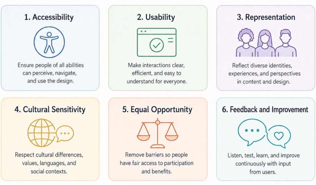
1. Accessibility
Accessibility is the foundation. Everything else rests on it.
Inclusive design has to work for people across a wide range of abilities — visual, auditory, motor, cognitive, and speech. In digital products, that means things like text alternatives for images, sufficient colour contrast, and interfaces that can be navigated without a mouse. These aren't nice-to-haves. In many countries, they're legal requirements.
- United States: Americans with Disabilities Act (ADA)
- United Kingdom: Equality Act 2010
- Australia: Disability Discrimination Act 1992
The scale of the need is hard to overstate. The World Health Organization estimates around 2.2 billion people live with some form of vision impairment. Roughly one billion people globally live with a disability of some kind. These aren't edge cases.
Here's how accessibility breaks down across five key dimensions:
Visual Accessibility
Sufficient colour contrast, resizable text, and meaningful alt text for images. These changes make the difference between a platform that includes 2.2 billion people and one that quietly excludes them.
Hearing Accessibility
Closed captions and visual indicators aren't just helpful for users with hearing impairments. They're useful for anyone watching in a noisy café or a quiet library. Designing for one group often helps everyone.
Motor Skill Accessibility
Navigation that works for someone with limited motor control — keyboard-only pathways, larger tap targets, reduced reliance on precise gestures — acknowledges that not every user interacts with a device the same way.
Speech Accessibility
Voice commands can't be the only option. Alternatives to voice input, combined with flexible voice recognition, create space for users with speech impairments to engage on their own terms.
Cognitive Accessibility
Clear language. Consistent design patterns. Customisable interfaces. Around 15% of the global population lives with some form of cognitive disability. Simplicity isn't dumbing down — it's good design.
2. Usability
Accessibility gets people in the door. Usability keeps them there.
Usability is about how easily someone can accomplish what they came to do — regardless of their skill level or familiarity with the product. Jakob Nielsen's five quality components are still the clearest framework we have:
Learnability
How quickly can a first-time user accomplish a basic task?
Efficiency
Once they've learned it, how fast can they move?
Memorability
If they come back after a break, how quickly do they find their feet again?
Errors
How often do users make mistakes? How serious are those mistakes? And can they recover easily?
Satisfaction
At the end of the session — did it feel good to use?
"Improving usability for accessibility often improves the experience for all users, not just those with disabilities."
That last point is worth sitting with. Captions help people who are hard of hearing. They also help people watching in a loud environment, or who prefer reading to listening. Clear navigation helps users with cognitive disabilities. It also helps everyone who's in a hurry or distracted. Designing accessibly doesn't create a lesser experience for some users and a better one for others. It tends to raise the floor for everyone.
Usability for Accessibility specifically brings these two disciplines together, focusing on three qualities:
- Understandability — users should be able to grasp both the information and the interface without effort
- Operability — the interface should work whether someone's using a mouse, a keyboard, a voice command, or an assistive technology
- Robustness — content should be interpretable by a wide range of user agents, including screen readers
3. Representation
Who do people see when they use your product?
Representation is about visibility. It's the question of whether a user — regardless of their race, gender, age, religion, ability, or sexual orientation — can look at a product and see themselves reflected in it. When they can, it builds trust. When they can't, it erodes it, even if the product works perfectly on a technical level.
There are four places representation shows up most clearly:
Inclusive Language
The words in your product — labels, microcopy, error messages, documentation — should be inclusive and respectful. Gender-neutral where appropriate. Aware of an international audience. Careful with idioms that don't travel well across cultures.
Inclusive Imagery
Visuals should reflect the actual diversity of the user base. Different races, ages, genders, body types, abilities. Not as a quota, but as an accurate representation of who's actually using the product.
Cultural Considerations
Date formats, time zones, currency symbols, colour associations — these differ across cultures and regions. A product that ignores this signals, loudly, that it was built with only one audience in mind.
User-Generated Content
For products where users define their own profiles, representation means giving them the tools to do it accurately. Diverse avatar options. Non-binary gender selections. Enough flexibility for users to define their own identity rather than fitting into a predetermined box.
4. Cultural Sensitivity
Cultural sensitivity isn't a filter applied at the end of a project. It has to be built in from the start.
It means understanding that the diverse cultural backgrounds of your users aren't variations from a default — they're the reality. And it means designing in a way that respects that reality rather than flattening it.
"A product that assumes one cultural norm is a product that inadvertently excludes everyone outside of it."
Five areas where this plays out in practice:
Functionality
The product should be genuinely useful to people from different cultural backgrounds, not just technically available to them.
Language
Translation isn't enough. You need to account for cultural nuance — idioms, formality levels, reading direction, the way meaning shifts across languages.
Content
Be aware of what's considered appropriate or offensive across different cultural contexts. What reads as neutral in one culture can land very differently in another.
Imagery
Images and symbols carry meaning that travels across borders — sometimes in the direction you intended, sometimes not. Know your visual vocabulary.
Colour
White signals purity in some cultures. In others, it's associated with mourning. Red means luck in some traditions and danger in others. Colour is never culturally neutral.
5. Equal Opportunity
Equal opportunity in design means that the quality of someone's experience doesn't depend on who they are.
Same features. Same access. Same value — regardless of gender, race, age, religion, disability, or sexual orientation. It's the design principle equivalent of a level playing field. And like all level playing fields, it has to be actively built. It doesn't happen by default.
Four elements that define an equal-opportunity experience:
Non-Discrimination
No design choices that disadvantage users based on personal attributes. This includes pricing structures, access tiers, and feature availability.
Fair Treatment
Rules, flows, and processes applied consistently across all users.
Access to Opportunities
Every user gets the same access to the product's core value — not a stripped-down version for some and a full version for others.
Inclusion
Equal opportunity and inclusion are inseparable. People need not just access but the genuine ability to participate fully, with their perspectives valued rather than tolerated.
6. Feedback and Improvement
Here's the thing most design processes get wrong: they treat launch as an ending.
Inclusive and equitable design is ongoing. The first version won't be perfect. It can't be — you can't anticipate every user's needs before you've heard from them. What matters is having a real system for collecting feedback and actually using it.
Feedback is the information that comes back from users and stakeholders — usability testing, surveys, interviews, analytics. It shows you the gap between what you intended and what people actually experience.
Improvement is what you do with that feedback. Refine the interface. Fix what's broken. Add what's missing. Reprioritise based on user impact, feasibility, and what the product is actually trying to do.
Four methods that work:
Usability Testing
Watching real users interact with a product reveals problems that no amount of internal review will catch. It's uncomfortable. It's also irreplaceable.
Surveys and Interviews
Qualitative research gets at the why behind user behaviour. It's slower than analytics, but it adds depth that numbers alone can't provide.
Analytics
Quantitative data shows what's happening at scale — where users drop off, which features get ignored, what flows break. It's not a substitute for talking to users, but it's essential context.
Iterative Design
Plan for change from the beginning. The best design processes build in regular cycles of testing and revision rather than treating improvements as exceptions to the plan.
A Final Thought
Inclusive and equitable design isn't a checklist. It's a commitment — to the full range of humanity, to ongoing listening, and to the belief that good design should work for everyone, not just the assumed default.
It's also better design. Products built this way tend to be clearer, more robust, and more widely used. The ethical case and the practical case point in the same direction.
That's rarely a coincidence.
Resources
- Microsoft Inclusive Design
- Google Belonging
- Apple Accessibility Hub
- Digital.gov
- Photo by Jon Tyson on Unsplash
No Comments.